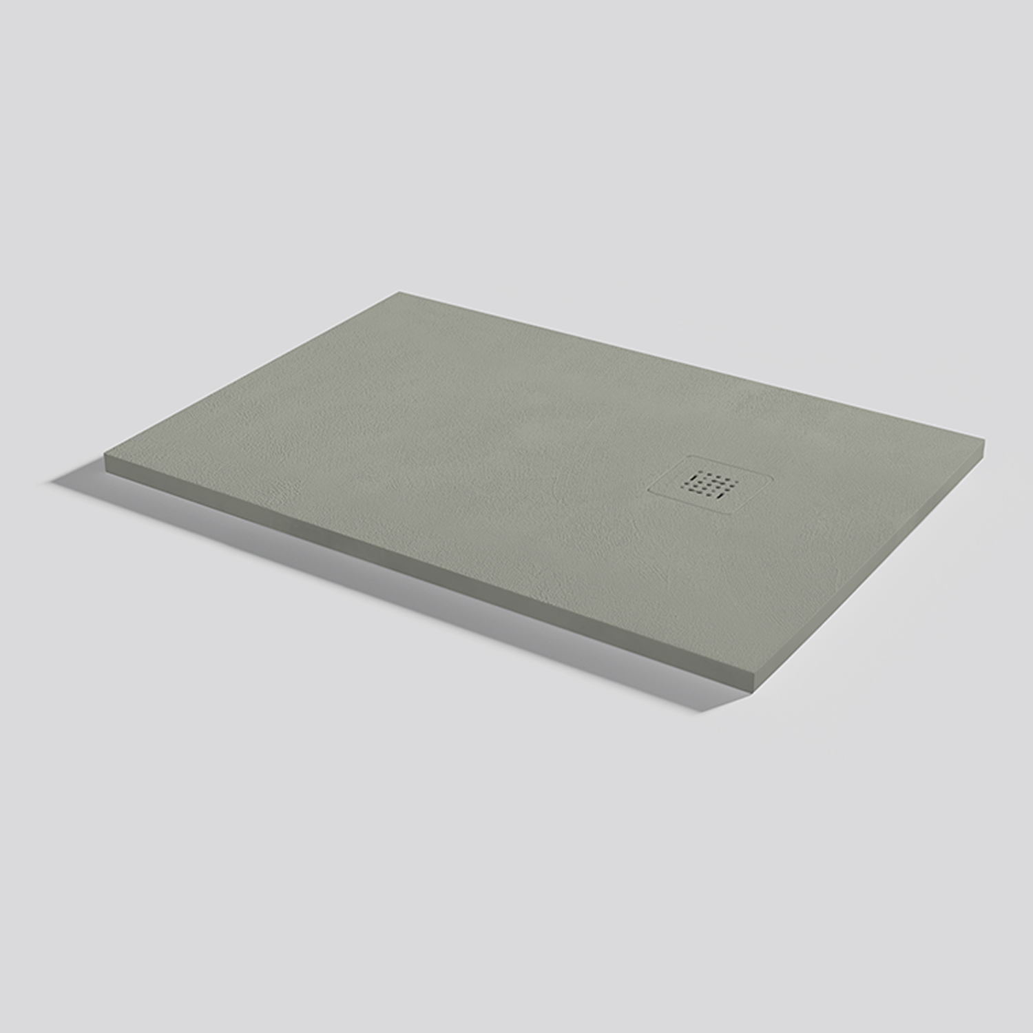
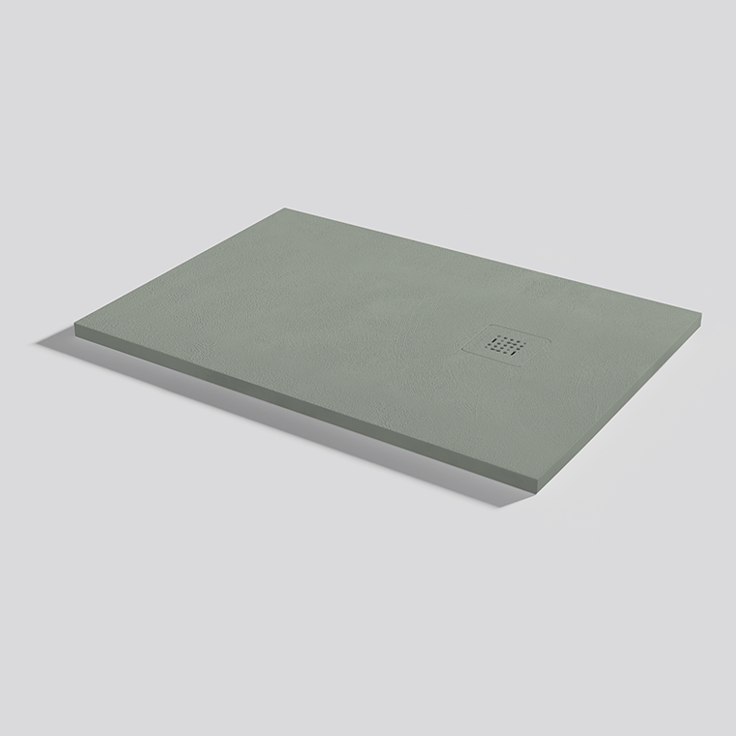
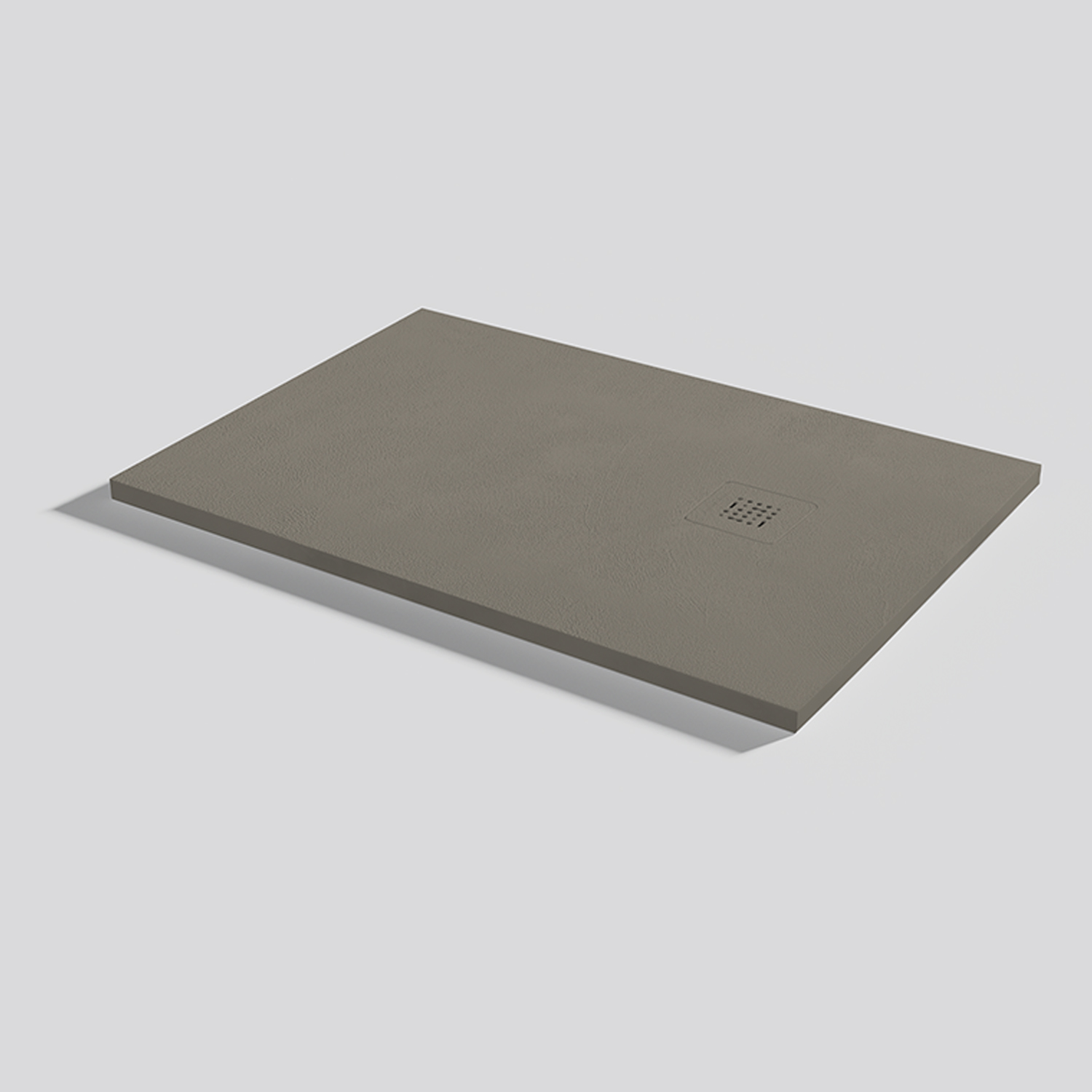
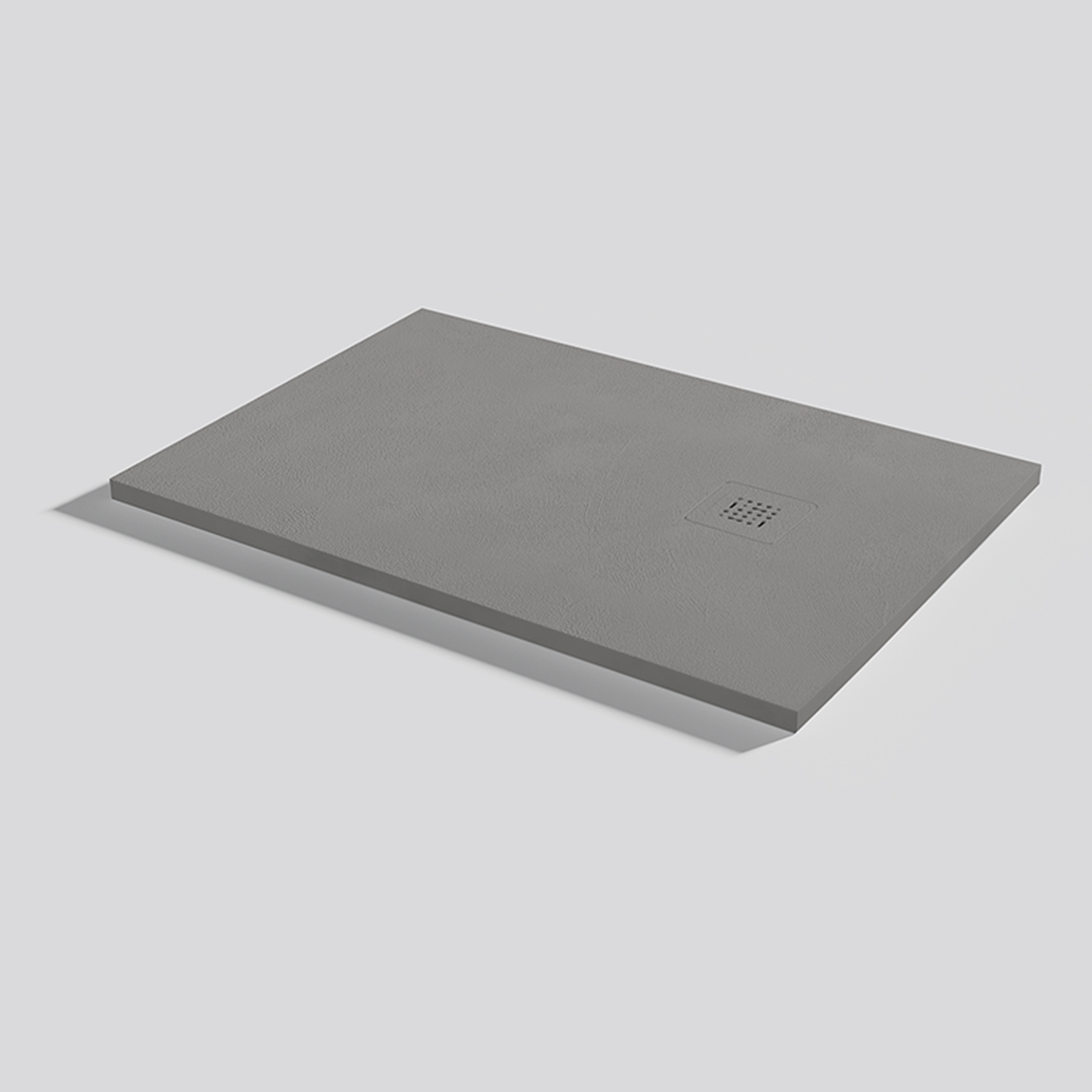
As we know, choosing colours for our decoration is the best way to give a space character. Regardless of the fashions or the style that we want to give it, we should think about what we are seeking to convey as our future state of mind within this space will depend on it. Don’t miss this post to learn about the shades that are in fashion and their meanings.
Pastel shades
Pastel colours have become a trend in 2019. We have seen light pastel palettes in shades of pink, green, blue… Even in combination with each other. A soft blend of romantic shades that create a sense of calm and well-being. For example, pink is able to raise our spirits when we are feeling down and orange tones convey optimism and reduce fatigue.
Greens
Green represents nature, conveys peace and hope, and makes us feel calm. If we are looking for an energising effect, we can choose shades with a higher proportion of yellow. On the other hand, for a more relaxing effect, we should move towards blueish shades.
Soft and light shades like aqua green, celadon, sage or light avocado have been key in indoor and outdoor decoration this year. These give your house a summery look, bathing it in light and freshness that transports us straight to the sea.

For a bold look, we can use an intense green that, whether or not combined with another lighter green will create a fresh jungle look. Additionally, darker colours add a touch of mysteriousness while brighter ones widen the space.
Browns
Brown shades are neutral colours which come from nature, like wood, and therefore convey warmth, safety and protection, creating a cosy and relaxing atmosphere. There is a whole range of browns from the darker shades such as chocolate to toasted or nude shades.
Blue
Blues did not disappear from the palettes in 2019. Blue is inspired by nature and brings serenity to the space. This powerful colour provides a dose of positive energy to any space, giving it the character you need.

Black and white
There are classics that never fail, and this is the case with the pairing of black and white. White is a more spiritual and innocent colour which gives a sense of purity to the space. In contrast, black is a strong and uninviting colour, so it should not be misused. However, it is the perfect accent for attaining sophistication and modernity. Together with white, it creates timeless and bright environments, without drab contrasts.
At Acquabella you can make the best colour combinations thanks to the endless customisation options for all kinds of bathroom solutions: shower trays, panels, worktops,sinks, columns, furniture and accessories.


